Custom Agent CSS Themes
When embedding an agent or panel into a website or application, you can use our default light and dark themes or specify your own.
The requirements for using one of our supplied CSS themes or creating your own are as follows -
- A CSS file needs to be publicly accessible from a https:// fully qualified URL
- The CSS file needs to support both light and dark theme (using the overrides for colors).
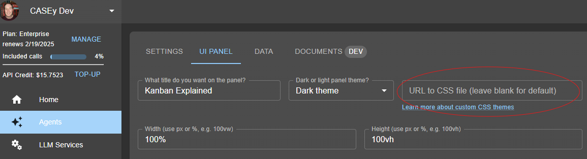
You specify the fully qualified URL in the UI Panel Agent Editing page -
Theme Library
We plan to post some specific themes here coming soon. If you have a theme that you want to share, email it to us support@llmasaservice.io or support@predictabilityatscale.com
Creating your own CSS Theme
Start with the following CSS and modify as needed.
All styling is controlled with these CSS entries.
/* --------------------------------------------------------
   LLM PANEL CSS
   Version: 1.2.0
-------------------------------------------------------- */

*,
*::before,
*::after {
  box-sizing: border-box;
}

/* Root Variables */
:root {
  /* Spacing Variables */
  --spacing-small: 0.3rem;
  --spacing-medium: 0.5rem;
  --spacing-large: 1rem;

  --border-radius: 10px;
  --icon-size-large: 1rem;
  --icon-button-size-large: 2.5rem;
  --icon-size-small: 1.5rem;
  --icon-button-size-small: 1.7rem;
  --button-send-size: 40px;
  --input-height: 40px;

  /* Light Theme Colors */
  --background-color: #fff;

  --title-text-color: #555;
  --title-background-color: #fff;
  --title-divider-color: #eee;

  --input-background-color: #eee;
  --input-border-color: #ddd;
  --input-text-color: #555;

  --button-background-color: #eee;
  --button-border-color: #ddd;
  --button-text-color: #555;
  --button-background-color-hover: #777;
  --button-text-color-hover: #fff;
  --button-drop-shadow: 2px 2px 4px rgba(0, 0, 0, 0.15);
  --button-disabled-color: #ccc;
  --button-disabled-background-color: #eee;

  --button-action-background-color: transparent;
  --button-action-text-color: #999;

  --prompt-background-color: #eeeeee;
  --prompt-text-color: #000;

  --response-background-color: #ffffff;
  --response-text-color: #000;

  --button-scroll-background-color: #777;
  --button-scroll-text-color: #fff;
  --button-scroll-background-color-hover: #999;

  --table-border-color: #777;
  --powered-by-text-color: #999;

  --background-color-mandatory: #ffcccc;
  --border-color-mandatory: #ff5555;
  --text-color-manadatory: #ff5555;
}

/* Dark Theme Overrides */
.dark-theme {
  --background-color: #171717;

  --title-text-color: #e0e0e0;
  --title-background-color: #171717;
  --title-divider-color: #333;

  --input-background-color: #2c2c2c;
  --input-border-color: #444;
  --input-text-color: #e0e0e0;

  --button-background-color: #3a3a3a;
  --button-border-color: #555;
  --button-text-color: #e0e0e0;
  --button-background-color-hover: #505050;
  --button-text-color-hover: #fff;
  --button-drop-shadow: 2px 2px 4px rgba(0, 0, 0, 0.5);
  --button-disabled-color: #808080;
  --button-disabled-background-color: #505050;

  --button-action-background-color: transparent;
  --button-action-text-color: #bbb;

  --prompt-background-color: #333333;
  --prompt-text-color: #ffffff;

  --response-background-color: #171717;
  --response-text-color: #e0e0e0;

  --button-scroll-background-color: #505050;
  --button-scroll-text-color: #fff;
  --button-scroll-background-color-hover: #606060;

  --table-border-color: #444;

  --background-color-mandatory: #2c2c2c;
  --border-color-mandatory: #ff5555;
  --text-color-manadatory: #e0e0e0;
}

/* --------------------------------------------------------
   LLM PANEL Styles
-------------------------------------------------------- */
.llm-panel {
  font-family: "Inter", system-ui, -apple-system, "Segoe UI", Roboto, sans-serif;
  font-size: 0.875rem;
  background-color: var(--background-color);
  display: flex;
  flex-direction: column;
  position: relative;
  padding: var(--spacing-medium);
}

/* Title Panel */
.llm-panel .title {
  font-size: 1rem;
  padding: var(--spacing-medium);
  border-bottom: 0.5px solid var(--title-divider-color);
  text-align: center;
  color: var(--title-text-color);
  background-color: var(--title-background-color);
}

/* Input Container */
.llm-panel .input-container {
  display: flex;
  flex-direction: row;
  align-items: center;
  margin-top: var(--spacing-small);
}

.llm-panel .email-input-container {
  display: flex;
  flex-direction: row;
  width: 100%;
  gap: var(--spacing-small);
  margin-top: var(--spacing-small);
  margin-bottom: var(--spacing-small);
  padding-right: var(--spacing-small);
}

.llm-panel .email-input {
  flex: 1;
  color: var(--input-text-color);
  padding: var(--spacing-small);
  background-color: var(--input-background-color);
  border: 1px solid var(--input-border-color);
}

.llm-panel .email-input-invalid {
  flex: 1;
  color: var(--input-text-color);
  padding: var(--spacing-small);
  background-color: var(--background-color-mandatory);
  border: 1px solid var(--border-color-mandatory);
}

.llm-panel .email-input-message {
  color: var(--text-color-manadatory);
  font-size: 0.8em;
  margin-top: var(--spacing-small);
}

.llm-panel .email-input-invalid::placeholder {
  color: var(--text-color-manadatory);
}

.llm-panel .email-input-set {
  flex: 1;
  color: var(--input-text-color);
  padding: var(--spacing-small);
  background-color: var(--background-color);
  border: 0px solid var(--background-color);
  opacity: 0.7;
  user-select: none;
}

.llm-panel .email-input-button:hover {
  background-color: var(--button-background-color-hover);
  color: var(--button-text-color-hover);
}

.llm-panel .email-input-button {
  padding: var(--spacing-small);
  background-color: var(--button-background-color);
  color: var(--button-text-color);
  border-radius: var(--border-radius);
  border: 1px solid var(--button-border-color);
  cursor: pointer;
  transition: background-color 0.3s ease;
  white-space: nowrap;
}

/* Textarea Styling */
.llm-panel .chat-input {
  flex: 1;
  color: var(--input-text-color);
  margin: 0 var(--spacing-small);
  padding: var(--spacing-small);
  border-radius: var(--border-radius);
  height: var(--input-height);
  min-height: var(--input-height);
  resize: vertical;
  background-color: var(--input-background-color);
  border: 1px solid var(--input-border-color);
}

.llm-panel .chat-input:focus,
.llm-panel input:focus {
  outline: none;
  border: 2px solid var(--button-background-color-hover);
  box-shadow: 0 0 5px var(--button-background-color-hover);
}

.llm-panel .chat-input:disabled {
  background-color: var(--button-disabled-background-color);
  cursor: not-allowed;
}

.llm-panel .chat-input:disabled::placeholder {
  color: var(--button-disabled-color);
}

/* Send Button */
.llm-panel .send-button {
  margin-right: var(--spacing-small);
  padding: var(--spacing-small);
  background-color: var(--button-background-color);
  color: var(--button-text-color);
  background-color: var(--input-background-color);
  border: 1px solid var(--input-border-color);
  border-radius: var(--border-radius);
  cursor: pointer;
  height: var(--button-send-size);
  width: var(--button-send-size);
  transition: background-color 0.3s ease;
}

.llm-panel .send-button:hover {
  background-color: var(--button-background-color-hover);
  color: var(--button-text-color-hover);
}

.llm-panel .send-button:disabled {
  cursor: not-allowed;
  color: var(--button-disabled-color);
  background-color: var(--button-disabled-background-color);
}

/* History Entry Container */
.llm-panel .history-entry {
  background-color: var(--background-color);
  padding-bottom: var(--spacing-medium);
  border-radius: var(--border-radius);
  margin-bottom: var(--spacing-medium);
}

/* Response Area (Scrollable) */
.llm-panel .responseArea {
  flex: 1;
  background-color: var(--background-color);
  border-radius: var(--border-radius);
  overflow-y: auto;
  padding: var(--spacing-medium);
  margin-top: var(--spacing-medium);
}

/* Chat Prompt Bubble */
.llm-panel .prompt {
  align-self: flex-start;
  padding: var(--spacing-medium);
  border-radius: 25px;
  margin-left: 5%;
  max-width: 100%;
  white-space: pre-wrap;
  background-color: var(--prompt-background-color);
  color: var(--prompt-text-color);
  margin-top: var(--spacing-small);
}

/* Chat Response Bubble */
.llm-panel .response {
  align-self: flex-end;
  padding: var(--spacing-small);
  background-color: var(--response-background-color);
  color: var(--response-text-color);
  margin-top: var(--spacing-small);
}

/* Copy & Thumbs Buttons */
.llm-panel .copy-button,
.llm-panel .thumbs-button {
  font-size: var(--icon-size-small);
  border: none;
  background-color: var(--button-action-background-color);
  color: var(--button-action-text-color);
  cursor: pointer;
  width: var(--icon-button-size-small);
  height: var(--icon-button-size-small);
  display: flex;
  justify-content: center;
  align-items: center;
}

.llm-panel .copy-button:hover,
.llm-panel .thumbs-button:hover {
  color: var(--button-text-color-hover);
  background-color: var(--button-background-color-hover);
  box-shadow: 0 0 5px var(--button-background-color-hover);
}

.llm-panel .copy-button:disabled,
.llm-panel .thumbs-button:disabled {
  cursor: not-allowed;
  color: var(--button-disabled-color);
  background-color: var(--button-disabled-background-color);
}

/* SVG Icons */
.llm-panel .icon-svg {
  width: var(--icon-size-small);
  height: var(--icon-size-small);
  margin: 0;
}

.llm-panel .icon-svg-large {
  width: var(--icon-size-large);
  height: var(--icon-size-large);
  margin: 0;
}

/* Button Container */
.llm-panel .button-container {
  display: flex;
  margin-top: var(--spacing-medium);
}

/* Button Container (Actions) */
.llm-panel .button-container-actions {
  display: flex;
  justify-content: space-between;
  gap: 0;
}

/* Scroll Button (Fixed at Bottom Center) */
.llm-panel .scroll-button {
  position: absolute;
  left: 50%;
  transform: translateX(-50%);
  bottom: 5%;
  background-color: var(--button-scroll-background-color);
  color: var(--button-scroll-text-color);
  border: none;
  border-radius: 50%;
  height: 2.5rem;
  width: 2.5rem;
  display: flex;
  align-items: center;
  justify-content: center;
  cursor: pointer;
  z-index: 10;
}

.llm-panel .scroll-button:hover {
  background-color: var(--button-scroll-background-color-hover);
}

/* Table Styling */
.llm-panel table {
  border-collapse: collapse;
  margin-bottom: 1em;
  border: 1px solid var(--table-border-color);
}

.llm-panel th,
.llm-panel td {
  border: 1px solid var(--table-border-color);
  padding: 8px;
}

/* Save, Email & CTA Button */
.llm-panel .save-button {
  flex: 1;
  background-color: var(--button-background-color);
  color: var(--button-text-color);
  border: 1px solid var(--button-border-color);
  border-radius: var(--border-radius);
  cursor: pointer;
  padding: 5px 10px;
  font-size: 0.8em;
  margin: var(--spacing-small);
  transition: background-color 0.3s ease, transform 0.3s ease;
  box-shadow: var(--button-drop-shadow);
}

.llm-panel .save-button:disabled {
  cursor: not-allowed;
  color: var(--button-disabled-color);
  background-color: var(--button-disabled-background-color);
}

.llm-panel .save-button:hover {
  background-color: var(--button-background-color-hover);
  color: var(--button-text-color-hover);
}

/* Suggestion Buttons */
.llm-panel .suggestion-button {
  background-color: var(--button-background-color);
  color: var(--button-text-color);
  border: 1px solid var(--button-border-color);
  border-radius: var(--border-radius);
  padding: 5px 10px;
  font-size: 0.8em;
  cursor: pointer;
  margin: var(--spacing-small);
  box-shadow: var(--button-drop-shadow);
}

.llm-panel .suggestion-button:hover {
  background-color: var(--button-background-color-hover);
  color: var(--button-text-color-hover);
}

.llm-panel .suggestion-button:disabled {
  background-color: var(--button-disabled-color);
  color: var(--button-disabled-background-color);
  cursor: not-allowed;
}

/* --------------------------------------------------------
   Powered By / Footer
-------------------------------------------------------- */
.powered-by {
  display: flex;
  justify-content: center;
  align-items: center;
  color: var(--powered-by-text-color);
  font-size: 0.8em;
  height: 100%;
  text-align: center;
}

.powered-by a {
  color: var(--powered-by-text-color);
  text-decoration: underline;
}

/* --------------------------------------------------------
   Modal Dialog
-------------------------------------------------------- */
/* Modal Overlay */
.modal-overlay {
  position: fixed;
  top: 0;
  left: 0;
  right: 0;
  bottom: 0;
  background: rgba(0, 0, 0, 0.5);
  display: flex;
  justify-content: center;
  align-items: center;
}

/* Modal Content */
.modal-content {
  background: white;
  padding: 5px;
  border-radius: 8px;
  box-shadow: 0 2px 10px rgba(0, 0, 0, 0.1);
  text-align: center;
  color: #333;
}

/* Modal Text */
.modal-text {
  color: black;
}

/* Modal Buttons Container */
.modal-buttons {
  padding: 5px 10px;
  display: flex;
  justify-content: space-between;
}

/* Modal Button Styling */
.modal-buttons button {
  padding: 5px 10px;
  border: none;
  border-radius: 5px;
  cursor: pointer;
}

.modal-buttons button:first-child {
  background: #ccc;
}

.modal-buttons button:last-child {
  background: #007bff;
  color: white;
}

/* --------------------------------------------------------
   Form Error Styling
-------------------------------------------------------- */
.invalid {
  border-color: red;
}

.error-message {
  color: red;
  font-size: 0.8em;
  margin-top: var(--spacing-small);
}